How to Choose the Perfect Colour Palette for Your Home: A Room-by-Room Guide
 BeMine Studio
Colour is the single most powerful tool in interior design. It can make a small room feel spacious, a cold room feel warm, a chaotic space feel calm, and a dull home feel alive. Yet choosing the right colours for your home is something most homeowners find genuinely difficult. With thousands of shades available and contradictory advice everywhere, it is easy to feel overwhelmed.
This guide will walk you through how our designers at BeMine Studio approach colour selection — room by room, principle by principle.
Start With the Feeling, Not the Colour
The most common mistake homeowners make is starting with a specific colour — “I want a blue living room” — rather than starting with the feeling they want to create. Before you look at a single paint swatch, ask yourself these questions:
How do I want to feel when I walk into this room? Calm and relaxed? Energised and inspired? Warm and cosy? Sophisticated and elegant?
How much natural light does this room get? North-facing rooms receive cooler, bluer light. South-facing rooms get warm golden light throughout the day.
How large is the room? Darker colours make rooms feel smaller and more intimate. Lighter colours expand the perceived space.
How will this room connect to adjacent spaces? Colours that clash between connected rooms create visual discomfort.
Understanding the Colour Wheel
You do not need to be an artist to use the colour wheel effectively. Here are the three most useful relationships for home interiors:
Complementary colours sit opposite each other on the wheel — blue and orange, green and red, purple and yellow. Used together they create vibrant, high-contrast combinations. Best used in small doses as accents.
Analogous colours sit next to each other — blue, blue-green, and green. These combinations feel naturally harmonious and are very easy to live with long-term. Most successful interior colour palettes use analogous combinations.
Monochromatic colours are variations of a single hue — navy, mid-blue, sky blue, and pale blue. Layering different tones of the same colour creates sophisticated, cohesive interiors.
Room-by-Room Colour Guide
Living Room
The living room is your home’s most social space. It needs to be welcoming to guests while also being comfortable for daily life. Warm neutrals — warm whites, creams, soft beiges, and warm greys — work universally well as base colours. Add depth with a feature wall in a deeper tone of the same family. Earthy terracottas, sage greens, and warm taupes are all excellent choices for 2025.
Avoid: Cool grey alone. It reads as cold and unwelcoming in many Indian homes where natural light varies significantly through the day.
Master Bedroom
The bedroom should promote rest and relaxation above everything else. Soft, muted tones work best — dusty blues, sage green, warm lavender, greige, and soft terracotta all create a calming atmosphere. Avoid highly saturated or stimulating colours like bright red, electric blue, or neon green.
The most sophisticated bedroom palettes use only two or three colours: a dominant wall colour, a complementary tone for soft furnishings, and a neutral for the ceiling and trim.
Children’s Bedroom
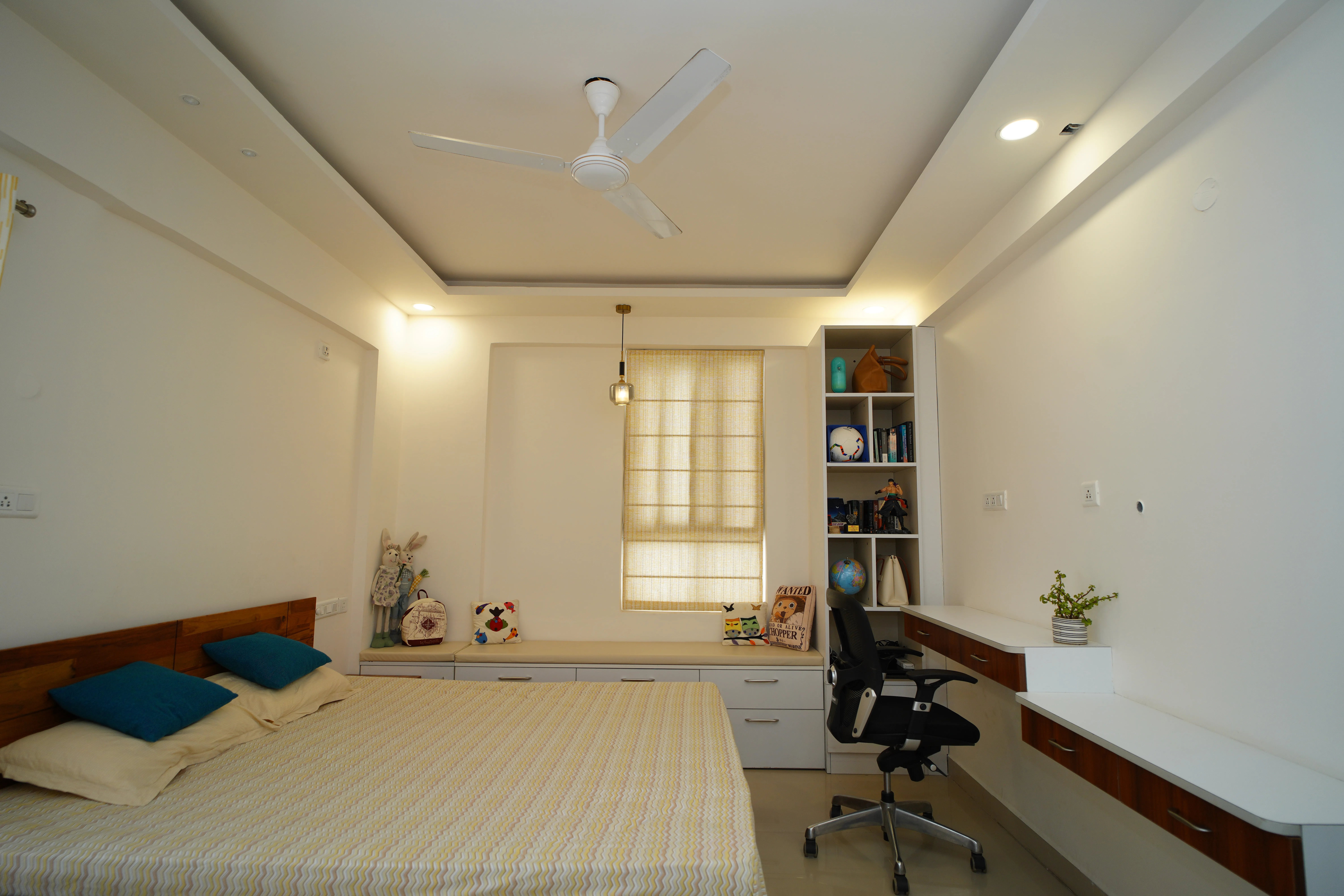
Children’s rooms offer the most creative freedom. While bright primary colours were the default choice for decades, research suggests that softer, more muted versions of those colours are actually better for children’s sleep and focus. Consider soft coral instead of bright red, dusty blue instead of electric blue, or mint green instead of lime green.
Leave room for the child’s personality to shine through in accessories, artwork, and bedding rather than committing the entire room to a specific theme that they will outgrow.
Kitchen
Kitchen colours need to work hard — they must look fresh and clean, hide everyday cooking mess, and complement the cabinet and countertop colours you have already chosen. White and off-white remain the most popular kitchen wall colours for good reason: they make the space feel clean, bright, and larger.
If you want more personality, consider a soft sage green or warm cream. For a bold statement, a deep navy or forest green on a single wall or kitchen island creates a dramatic, high-end look.
Bathroom
Bathrooms benefit enormously from a considered colour palette. Soft blues and greens reference water and nature, creating a spa-like atmosphere. Warm whites and stone tones feel luxurious. Dark colours — charcoal, deep green, black — can look incredibly sophisticated in a well-lit bathroom.
The key in bathrooms is to ensure the grout colour complements the tile colour. White grout on white tiles looks fresh. Dark grout on large format tiles creates a strong graphic pattern.
Study or Home Office
Your workspace colour palette directly affects your productivity and focus. Blues and greens promote calm focus — ideal for analytical work. Warm yellows and oranges stimulate creativity — good for creative professionals. Avoid overly stimulating colours that compete with your screen.
The most important consideration for a home office is controlling natural light. If your study gets strong afternoon sun, cooler wall colours will balance the warmth. If it is a darker room, warm tones will compensate for the lack of natural light.
Practical Tips Before You Paint
Always test paint colours on the actual wall before committing. Paint a large swatch — at least 60 by 60 centimetres — and observe it at different times of day and under artificial light at night.
Remember that paint colours always look darker on a wall than they do on a small chip or screen.
Consider the undertones of your chosen colour carefully. A grey with pink undertones will clash with warm wood furniture. A white with green undertones will look strange next to cool blue furnishings.
Use the 60-30-10 rule: 60 percent dominant colour, 30 percent secondary colour, 10 percent accent colour. This ratio creates visual balance in any room.
Let Us Help You Get It Right
Choosing the wrong colour is an expensive mistake. At BeMine Studio, every project includes a detailed colour consultation where our designers analyse your space, your lighting conditions, your existing furniture, and your personal style to recommend a palette that will look and feel exactly right.
Book your free consultation today and let us take the guesswork out of colour.